Design

Easier said than done

An attractive graphic design that aligns with your brand. Easier said than done. Prefer consistency and recognition! The best design aligns with who you are and what you want to convey. But at the same time, your product or service must be different from the rest. Graphic design is part of your tone. A distinction is made here between online and offline design. As 79 Ratio, we speak both languages.

Online Design

You only make an impression on the first impression. Nowadays this impression is already created online. Is your website taking a long time to load completely? Is your website not easy to use? Then your visitor will not wait long and most likely will not come to your site again.

Did you know that a user experiences the 1-second loading time as enjoyable? The mails and/or newsletters you send also create a specific experience with your brand. Is it our opinion? Provide a personal touch, it always works.

Detail-oriented, technical and sensitive

At the start of building a website, we look at the basics of your organization. We want to do it right the first time. That’s why it’s better to have too much information than too little.

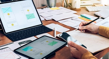
Next, we create a clean structure that makes your website work and appealing for desktop and mobile devices at the same time. The critical and approving eye of our graphic team will always be on you.

We carefully map out each part of the marketing and communications plan. Then we enter the market with this strategy and shoot the main bullet.

So how do we start? Simply, in the beginning! 😉

Successful and accessible on any platform!

Offline design

Want to design a brochure or flyer? Do you prefer the full package where we handle all the printing? Or are you lacking the wow effect and looking for a new design or logo? Again, we proceed on the basis of an analysis.

Who knows, maybe it’s the corporate identity that doesn’t match your logo and vice versa. We give you our opinion of what is really needed in your organization.

SEO?

This is our thing!

Check out the strategic overview below that worked wonders for Google.

Magical, right?

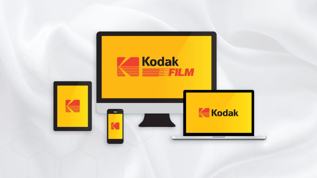
What is a Responsive Logo?

What is a Responsive Logo?

Logonuzu kullanmak için her zamankinden daha fazla yer var ve hepsinin boyutu çok farklı. Responsive logo tasarımları markanızın akılda kalıcılığını sağlayarak, bu sorunlarımıza çözüm sunuyoruz. Başlangıçta bir tasarım trendi olarak düşünülen Responsive Logolar, bir hevesten çok en büyük dijital tasarım sorunlarından birinin üstesinden geliyor: aşırı boyutlarda netliği korumak. Yerleştirildikleri yere…

How Can You Make Your Text Areas Perfect?

How Can You Make Your Text Areas Perfect?

Metin Alanlarınızı Mükemmel Hale Nasıl Getirebilirsiniz? 1-Açıkça Görün. Dikdörtgenleri köşeleri yuvarlatılmış şekilde kullanın. Tasarımınızın metin alanlarıyla tutarlı olması gerektiğini unutmayın 2-Büyük Harf Kullanmayın. Metnin tamamında büyük hark kullanılması okumayı güçleştirir. 3-Alan Uzunluğunu Metne Göre Ayarlayın. Alan genişliği, metni daha görünebilir hale getirir. 4-Hatalar İçin Uyarı Verin. Düzeltilmesi gereken alanda hata…

What is Logo Evolution?

What is Logo Evolution?

Logo Tasarımında Püf Noktalar Müşterilerimizle aramızdaki en güçlü bağlardan biri de markamızı temsil eden logomuzdur. Logo tasarımında dikkat edilmesi gereken bazı püf noktaları senin için derledik. Hadi birlikte göz atalım. Firma kimliğinizi en kısa yoldan sergileyen logo, tanınırlığınızı ve bilinirliğinizi artırmak, müşterileriniz ile aranızdaki bağı güçlendirmek ve firma kimliğini tam…